Publicis Sapient
The Children’s Place: Online Loyalty Initiative
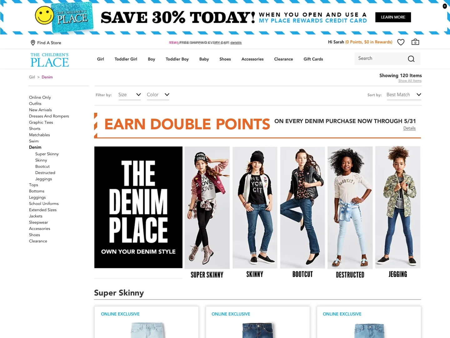
The Children's Place is a children's specialty apparel retailer in North America. It sells apparel, accessories, footwear and other items for children. The Company operates through two segments: The Children's Place US and The Children's Place International. It competes with Target, The Gap, Gymboree, Carter's, J.C. Penney, Kohl's and Walmart.
the goal
The company wanted to incorporate their loyalty program—named My Place Rewards—into their existing website and mobile app. The program allows customers to register for the loyalty program and earn points, rewards and coupons. The business objective was to create visibility to drive engagement; and increase program membership and applications for the My Place Rewards credit card.


The Challenge
The directive from the Marketing Team and the Product Owner was to assess the existing site templates and provide strategic recommendations for placement of the loyalty program information within the browsing, checkout and account management experience.
Our biggest challenge was determining the proper content hierarchy and how to incorporate the loyalty messaging, calls to action and required visual elements into an existing framework without disrupting the experience or interrupting users from performing their primary tasks. We also needed to make recommendations on where to promote the feature and entice users to enroll.
Mobile app wireframes
my role
I was responsible for leading a 2-person design team and collaborating with the client’s design, mobile app and development teams; key stakeholders; and project management. I managed the experience strategy and design thinking; and coordinated delivery of wireframes and visual design assets.
The Design Process
We began the project by participating in a 2-day prioritization workshop to hear the requirements from business/IT stakeholders, and client partners their ideas for integrating the loyalty capabilities into the existing digital commerce platform. Following this workshop, I worked with our project manager to staff the project, define the design sprints, set up review cycles and coordinate delivery.
Each day, the design team presented in-progress work to the Product Owner, Loyalty Program Manager and client’s Experience Lead, Mobile App Lead, and Visual Design team. During the reviews, we presented high-fidelity wireframes and visual renderings that included small screen (mobile web), large screen (desktop) and mobile app templates. Feedback was gathered and prioritized, and iterations prepared for the next day. Once a solution was approved, it was validated by a BA, and the page designs and display rules were incorporated into a Functional Specifications document. The final, high-fidelity visual renderings were packaged and delivered to the client’s design team.


The design concept
The team created a series of lockups, in several design configurations, to present the loyalty information in a consistent and easily identifiable display within the established page templates. We inventoried the website and the mobile app to identify the page templates and components that would need to accommodate this additional content. We analyzed the content hierarchy and layout, in order to provide recommendations on placement and format.
We created a design system that could be flexible enough to handle dynamic copy and data based on customer type. The visual elements were carefully considered so that the arrangement of the information was easily scannable and clear. We recommended color-coding each lockup configuration by customer type (guest, My Place Rewards member and credit card holder) aligning them to the established visual treatment of other loyalty promotional components that are display throughout the site/app.


the result
The client has been incrementally introducing our recommended loyalty program components into the website and mobile app experience, and performing user testing to gauge feedback.